Wix Magazine layout can be useful for a wide variety of companies and individuals.
What a WIX magazine layout consists of?
Basically it helps the website owner display a number of images in a form of a magazine, meaning that the user has the ability to read each one and turn to the next page exactly as they do when they are using a normal magazine or newspaper. This actions is called “page flip”.
Whether the website is about a design portfolio, a real estate company, a newspapper, a brochure or even a magazine, the flipping page layout can add to the user experience as it simulates the real magazine flipping page experience.
Another great advantage of the magazine layout, is the display format is mobile devices. If the brochure style widget is diplayed in a mobile phone or an iPad, the user experience is event more realstic as the user is using the finger to “turn” the vitrual page and continue reading in the next one.
The flippping effect is great for brand catalogues, graphic designers, brochire folios, and also fashion blogs and lookbooks.
When designing a magazine layout on a WIX page, a number of options is available. Website owners can use Gallery styling, images in row or “flipbook” widget.
In any case, regardless of the tool used to display the magazine, the most important factor for the end result is the initial material, the initial design.
Visual Factors
Some key factors that can improve the overall magazine design are:
- clearly defined sections (columns and rows)
- use of high quality pictures and captions
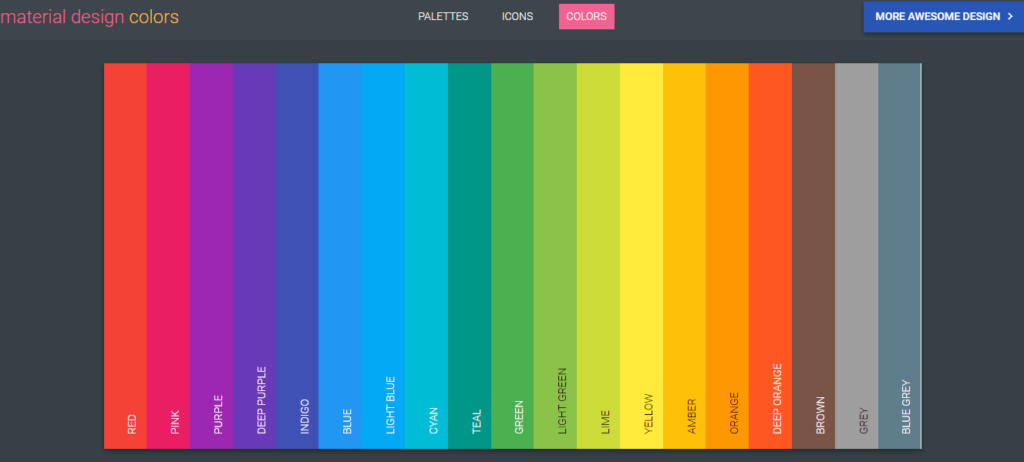
- carefuly selection of the colors used on each page (check the material pallete color mapping here)
- inclusion of “quotes” – quotes generally help define sections and also build trust when in right context
- consistency on margins on every page
- consistency on fonts and typography on every page
- smart usage of white spaces
Material Pallete Color Map
The reader should be always be focused on the section he is reading, and not be disctracted by the next section.
Magazine Layout – Structure of contents
Extremely important in the whole navigation is the overall structure of contents and the hierarchy of the different magazine sections. The reading flow should be natural amd each subject should be based on the previously used material. Even in the case of advertising brochures and fashion lookbooks, the sequence of the images and products displayed on the pages should follow a natural order. For instance, in a home furniture brochure, the kitchen section can be followed by products used inside the kitchen and not interrup the experience by presenting the outdoor section between kitchen and kitchen related products sections.
Size of Initial Input
When the inital input is PDF images, a nice and professional magazine layout in a WIX page is also depending on the actuall size of each PDF page. To keep consintency when converting the PDF’s to a wix magazine layout the size of each PDF image should be the same with all others. This is to keep the aspect ration same and helpe the converter extract a correct result.
Size of Magazine inside a WIX Webpage
It is highly important to determine the default size of the flipbook magazine widget, aka the visual size of the brochure follio when the user visits the webpage. The widget containing the flipbook should have a natural size when compared with the rest elements of the website. The cover image should be big enough, so that the reader can easily determine if the magazine is of his interest – at this stage the reader will decide if he will click inside the widget to actually open the magazine experience and start navigating to the internal pages.
Most readers enjoy experience a magazine layout in Full Screen Mode, but in order to reach this stage they need to be triggered by the default cover image. A reletively small wix widget containing the magazine flipbook will result in a unreadable coaver image, preveninting user from opening the whole experience.
You can try Flipbook App for WIX to create your own magazine layouts for your brochures, catalogues and lookbooks.


